If you are reading this, you are probably very interested in what you can do with data in football. One of my flaws is that I constantly am looking for new models. I want to innovate and create, basically finding the next expected goals to be important in the analysis space. Okay, that’s perhaps more into my brain than needed, but it’s an important lesson for me: I don’t always have to create everything from raw data.
You can create meaningful insights, scores and indexes from already existing metrics. In this article, I will look at existing metrics and try to find players with the most creative passing. I will do that by combining several metrics into a score which lead to more insights to look for players that do well in creative passing.
Data
In this specific little research we will work with player aggregated data from Wyscout. It contains the 2024-2025 season in Belgium’s first tier. I will filter for players that have played at least 900 minutes (which is the equivalent of the 10 full games). Then I will also filter for attacking midfielders (Position = “AMF”), because I want to find the most creative passers in the attacking midfield.
The data was downloaded on August 13th, 2025 and all handling, cleaning and calculations is done in Python. This can also be done in excel itself, or in other programming languages such as R or Julia.
Methodology
The Innovative Passing Index (IPI) was designed to measure a player’s ability to circulate the ball, penetrate defensive structures, and create attacking opportunities. Passing metrics were divided into three functional groups. Ball Circulation captures possession retention and accuracy, including Passes per 90, Accurate passes %, Forward passes per 90, and Accurate forward passes %, each weighted equally at 0.25. Penetration reflects line-breaking ability through metrics such as Passes to final third per 90 (0.20), Through passes per 90 (0.30), Accurate through passes % (0.20), and Progressive passes per 90 (0.30). Creativity focuses on vision and chance creation, represented by Key passes per 90 and Accurate progressive passes %, both weighted at 0.50.
To ensure comparability, all metrics were normalized using a min–max scaling method, transforming values to a range between 0 and 1. This process removed unit differences and allowed for fair weighting. Within each group, the normalized metrics were multiplied by their respective weights and summed to produce three sub-scores: Ball Circulation Score, Penetration Score, and Creativity Spark Score. These sub-scores represent performance in each passing dimension independently.
Finally, the IPI was computed as a weighted combination of the sub-scores, reflecting their relative importance to overall passing impact: 40% Ball Circulation, 35% Penetration, and 25% Creativity. This weighting prioritizes consistent ball circulation as a foundation for innovative passing while recognizing the importance of progressive penetration and creative playmaking. Higher IPI values indicate players who excel in all three areas, while imbalances highlight specialists whose strengths lie in specific aspects of passing.
Analysis
When we have run the code through our data, we come with a list of players.
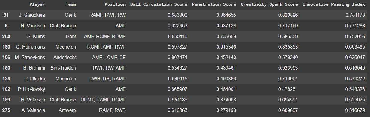
These players score the highest on the Innovative Passing Index. I want to now see how good players are compared to each other and use visuals. The first visuals I’m going to look at is a terniary plot.
In this plot we have the three new scores against each other. Each scatter is a player with their score for each individual new metric. In this visual we can see how the player do in relation to their three different scores. I have looked at the Innovative Passing Index and created outliers, to see which players score the best across all three metrics. They are most allround.
What we can also do is to see how the players look in bar graph plots.
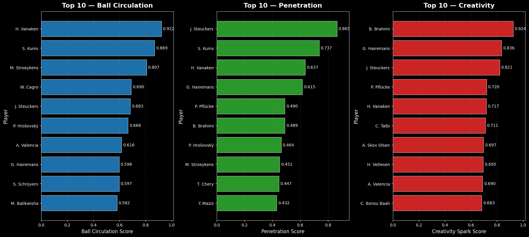
In the image above we can see which the top 10 players are in each score. This gives us an idea of the top player and whether top players also score high in other metrics. Vanaken, Kums, Stroeykens, Steuckers, Brahimi en Harremans are players to keep an eye on.
We have now looked at it from a list perspective, but how does it look if we look at percentiles for this?
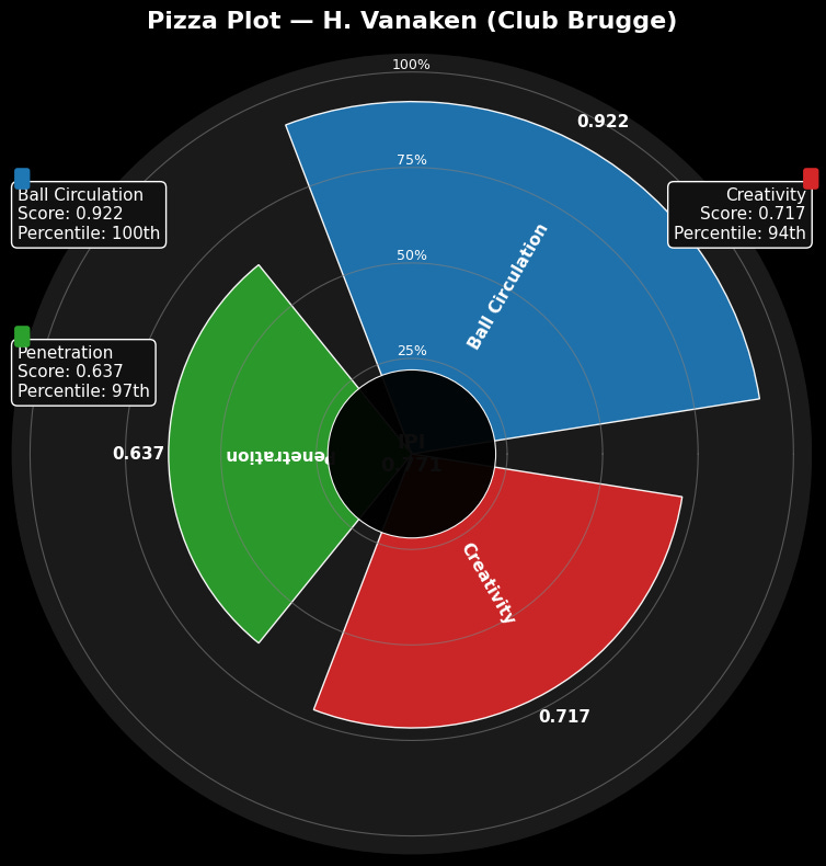
If we use this kind of visual, we can see that Vanaken scores high on all the scores, but he scores highest in ball circulation, followed by creativity and penetration. It’s possible to visualise this in a different way too:
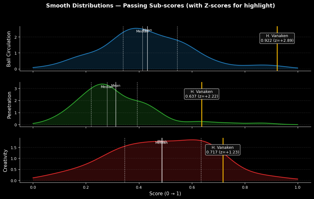
Another way of visualising how well Vanaken scores in comparison to his peers in the same position. It shows how well Vanaken is in the distribution of the scores and what the median/mean is for these scores. Based on z-scores we can also see how much Vanaken is an outlier, because of his positive z-scores.
Citation
admin. (2025, augustus 14). Finding players with the Innovative Pass Index. Waltzing Analytics. https://waltzinganalytics.com/2025/finding-players-with-the-innovative-pass-index/