There is a thing about women’s football what I don’t like and that’s the lack of publicly available data. And if there is data available, it’s often flawed and very small in variety. One of my aims for this year and the years to come is to help in changing that. Sharing my experiences and metrics, but also opening up possibilities to work with data.
In today’s article I want to look closer at what event data can mean for playing styles. Often when we look at data metrics we will see them only as performance data, but that couldn’t be further from the truth. In fact, it often says more about intention and playing style anyway. And, that’s what I want to show you today: how important data can be to create a data-specific style of playing identity.
Notable work
I’m definitely not the first to coin this kind of work. In fact, I’ve been heavily inspired by earlier work. It’s not fair to claim this as my own, but it’s good to build on that. First piece that really inspired me was a piece on Analytics FC by Piotr Wawrzynow (now Lead Data Scientist at Wisla Krakow)
I think this gives this idea of how we can start with Coach ID, recruitment for managers and head coaches. Building on that we can look at playing styles, like Ben Griffis.
Ben describes not only the playing styles, but also adds the GK build-up metric. Again, what I’m going to do is not new in terms of the metrics, but there is method in creating these metrics. I’ve not have had any code from Piotr or Ben, but it’s a great exercise to recreate existing metrics, scores, indexes and models. You learn a great deal from them.
Creating the metrics
It’s good to understand that every metric is subjective to bias from the ones creating them. Creating metrics is about choices and boundaries you choose. So that means that my metrics might differ from others whilst we are still talking about the same thing.
For our playing style analysis I want to create the following metrics:
- GK Build-up
- Set piece involvement
- PPDA
- Verticality
- Counters
- High Press
- Low Block
- Territory
- Crossing
- Wing Play
- Deep Circulation
- Long balls
I created these metrics with StatsPerform/Opta data. There are different data providers out there: Wyscout, StatsBomb, IMPECT, Skillcorner and more, I’m using Opta event data. The data I use is raw data and can be constructed from that giving me full control of how I want the data to behave. Another important thing to note is that this data is on-ball data, nothing in this analysis take off-ball data into account. So, view this data in that light.
The data I have chosen is data from women’s football. I divide my time between men and women’s football equally, but the access to event data in women’s football is much less, therefore I want to talk about that in this article more.
The leagues which are in my database are th English WSL, Italian Serie A, French D1, German Frauen-Bundesliga and the Spanish Liga F. I recognise that the American NWSL is a top league as well, but their 2025 season is ongoing and things can still change for the data.
The metrics are created in Python by calculating the different variables. What’s important to know is how you define the metrics in football. Every definition corresponds with calculations and boundaries. For example, GK Build-up corresponds with the % of passes are played by the goalkeeper of the total passes that are not long passes. If you define it as that, you also need to calculate it like. This has been done with all the metrics above.
When you have converted the raw data into the metrics, you load all the matches for the 2024-2025 season for the leagues you are looking at and you have data creation process done. I have also added a column for “League”, as I also want to look at leagues compared to each other.
Percentile ranks
Comparisons can be done in different ways. For me it’s often a choice between percentile ranks and z-scores.
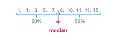
Percentile ranks are are a statistical measure that indicate the relative position of a score within a dataset. In simpler terms, a percentile rank tells you how a particular value compares to all other values in a dataset in terms of percentage. We talk about the median in this sense:
I could also use z-scores, but I want to look at how a team performs compared to other teams. If I would want to look at how extreme teams perform relative to the mean, I would use z-scores – but that’s not the case here.
If we calcultate them all, we look at all teams in our database and how they compare to the rest in terms of percentiles for each category:

You can see a few 0 and 100 percentiles, this I will change in the visualisations to 1 and 99, to adjust the absolute of all and nothing, which shouldn’t be in the visuals or analysis.
Visualisations
One of my favourite things to do when conducted this researches or analyses is to find the right visualisation to portray the data. What depicts the data most accurately? What’s the fanciest to look at? I think you have to find the balance between those two, but most important is that you convey the data correctly.
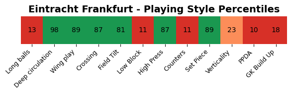
For me there are three options to visualise it. To show the difference I will show you Eintracht Frankfurt in the German Frauen-Bundesliga.
The first one is to use bars:
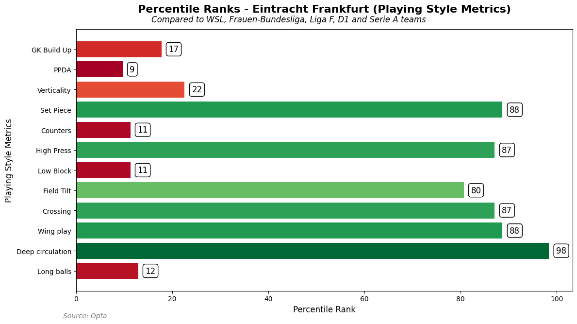
In this bar we can see how the data compares to each other. Every metric has a single bar and connected with the percentile rank next to it. We can easily see how “well” the team performs across the metrics.
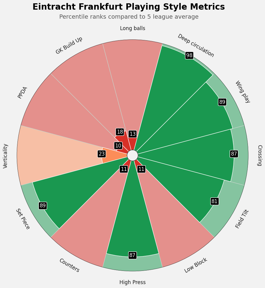
In the image above we see a pizzaplot and we see this on social media a lot. Not because it’s the best, but it looks the best. However, it’s harder to convey the information – you have to focus and see what are outstanding metrics. We are helped with the colors, but in essence this is better for aesthetics than it is for usability.
This is clear, a heatmap. I think it conveys the information well, but there is one thing missing: the visual perception. Everything has the same length and therefore it doesn’t registrate as different to our brain. Again, the colors do help, but it’s not the best.
I think bars are the best for conveying this information and that’s why I would like to go forward in our analysis with those bars.
Analysis: Playing Style
Of course, now we have seen the metrics and how we can visualise them. The next step is to look at playing style. What do these metrics actually say? And, how do we convert them into describing playing style?
First I will take those twelve metrics and categorise them:
- Build-Up & Possession
- Attacking Directness & Transitions
- Defensive Shape
- Pressing & Disruption
These categories tell us about playing style and how well clubs do in them, or not.
Let’s take another example, we will take Barcelona in Liga F and Chelsea in WSL.
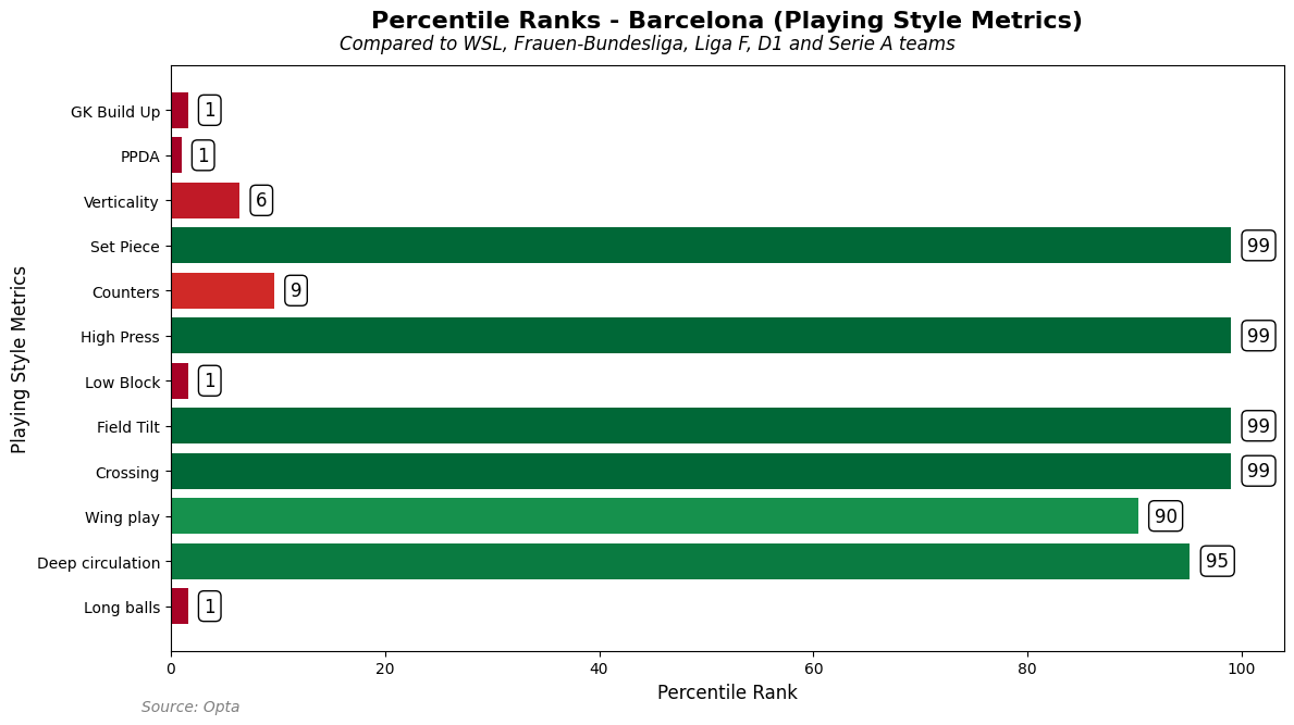
Here we have Barcelona, who dominate certain metrics. It seems that score highest in playing style for set piece, high press, field tilt and crossing, while also scoring high for wing play and deep circulation. While scoring incredibly low on the other metrics. How does that translate to playing style?
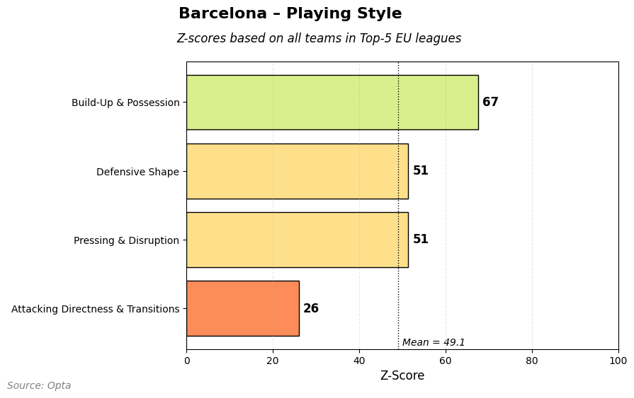
Now we have converted it into z-scores for categories (and then normalized for 1-99) and then we can get scores for 4 distinct categories. For Barcelona we can see that they score highest on build-up and possession which isn’t a surprise.
Now look into the WSL champions, Chelsea:
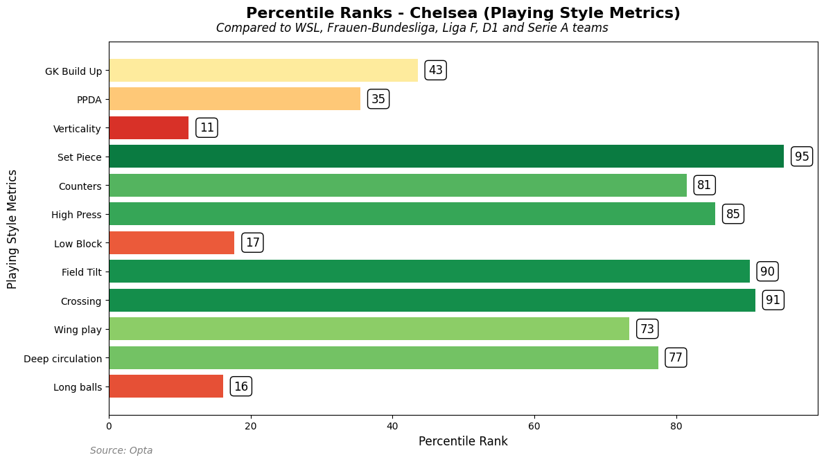
Here we see Chelsea and they score high as well, just like we have seen with Barcelona. They score high on set pieces, counters, high press, field tilt and crossing. Above average on wing play and deep circulation. So, how does that look in terms of playing style?
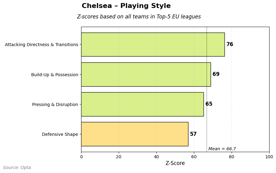
As you can see Chelsea score higher on build-up and possession than Barcelona compared to every team, but that’s not the highest category of playing style. That’s attacking directness and transition.
Analysis: Similar teams
What I also love to do right now is to look for similar teams based on playing style. This is important in my opinion for assessing whether a player from one team could be a good fit for the other. I want to have a look for 5 similar teams for AS Roma, Brighton and OL Lyonnes:
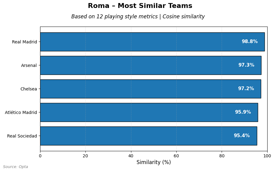
If we look at how Roma play, similarities reveal that Real Madrid, Arsenal, Chelsea, Atletico de Madrid and Real Sociedad are the most closest to them.
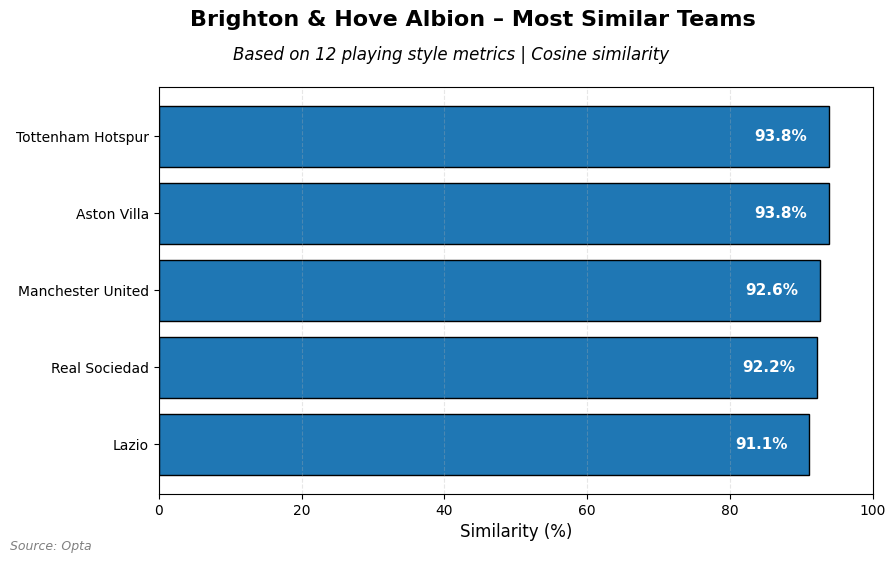
Looking at Brighton we see that Tottenham, Aston Villa and Manchester United come close to their playing style. From Spain and Italy those Real Sociedad and Lazio.
Finally we look at powerhouse OL Lyonnes from France:
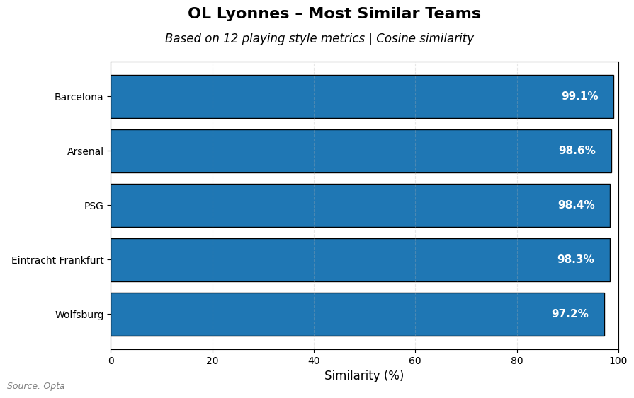
Barcelona comes closest, followed by Arsenal, PSG, Eintracht Frankfurt and finally Wolfsburg. I think it’s very interesting that the top teams seem to be very close in playing style.
Final thoughts
We can do a lot with data, but I think there are a few good lesson if you work with data:
- We can draw playing styles from raw event data, but it’s biased in its making
- Playing style similarities also are influences on a league level, which we haven’t looked at in this article
- Off-ball data is not incorporated which will influence both the playing style and similarity
- Be aware of what you are doing when creating metrics, a slight change might have huge effects.
Citation
admin. (2025, augustus 8). Modelling distinct playing styles in Women’s football. Waltzing Analytics. https://waltzinganalytics.com/2025/modelling-distinct-playing-styles-in-womens-football/