
There has been a huge shift in the use of data in football in the last few years. It would be foolish for me to claim otherwise. I’m very pro using data in your performance workflow as well as in the recruitment aspect of running a club, but as a consequence, we also have seen an influx of public analysis with data.
I truly love seeing data analysis on blogs, websites and youtube — and also the data visuals on Twitter for example. But often the analysis isolates data as the only thing being done, while in reality you always need the eye test at some stage. Don’t get me wrong, I really have posted so many visuals without context, but I think I want to inform rather than analyse. Which was always a bit ignorant of me, because no one sees that distinction without explanation.
Going more into it, data is used to analyse “who are the best” in a certain position or role, but purely looking at data — is always going to be tricky. The data profiles belonging to a second striker or goalscoring attacker are not set in stone and therefore are subject to bias. That bias will be reflected in your outcome. Because some have this notion that data is always right, people can come to a certain point of view.
There are different ways of showing performance via data in relation to others/peers and I will show three different ways that are used the most, but are quite different:
- Percentile ranks
- Z-Scores
- Similarity Scores
What’s vital in this part of data analysis is weighing data. Weighing player data is crucial in data analysis for several reasons. First and foremost, player data often contains a wealth of information that can offer valuable insights into performance, strategy, and decision-making. However, not all data points are equally significant, and some may carry more weight or influence than others. By assigning appropriate weights to different data elements, analysts can prioritise and account for the relative importance of each piece of information.
Weighting player data also helps in addressing biases or confounding factors that may exist within the dataset. Not all players or games are created equal, and there are often contextual factors that can influence the outcomes. For instance, a player’s performance in a high-stakes playoff game might be more indicative of their true abilities than in a regular season match. By weighing the data based on factors such as game importance, opponent strength, or playing conditions, analysts can mitigate the impact of such biases and obtain a more accurate representation of player performance.
Furthermore, weighing player data enables the creation of composite metrics or performance indicators that capture multiple aspects of a player’s contributions. By assigning appropriate weights to different statistical categories, analysts can develop comprehensive player ratings that reflect both individual achievements and team dynamics. This holistic approach provides a more nuanced understanding of a player’s overall impact on the game.
For more on weighing data and percentiles vs Z-Scores — which I will be talking about below — make sure to this article by Ben Griffis. He explains the math about it a little better and gives great context.
To illustrate these theoretical ways of analysing data, I’m going to look at the top 5 leagues in Europe and analyse strikers, with emphasis on goal contribution. The data is from Opta via FBREF.

Percentile ranks
Percentile ranks are used in data analysis for several reasons. Firstly, percentile ranks provide a standardised way to compare individual data points within a larger dataset. By converting raw data into percentiles, we can understand the relative position or performance of a specific data point compared to the rest of the data in our files.
Additionally, percentile ranks allow for easier interpretation and communication of data. Instead of dealing with raw values, which can vary widely depending on the scale or unit of measurement, percentile ranks provide a common language to discuss and compare data points. For example, saying that a player’s performance is in the 90th percentile indicates that they outperformed 90% of the other players in the dataset.
Percentile ranks help mitigate the impact of outliers or extreme values. By focusing on the position of a data point within the distribution, extreme values have less influence on the overall analysis. This can be particularly important in cases where outliers can skew the interpretation of data.
Before I calculate percentile ranks and put this into a visual, I need to make some adjustments to my data frame:
- Players with only 500+ minutes played
- Only forwards
- Data that shows attacking, passing and defending stats
- Selecting 2022–2023 season
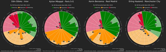
In the image above you see different forwards in T5 leagues in percentile rank radars. Now it’s of course quite obvious that they all are very good at shooting/attacking metrics. The difference between the profiles and the style of players they are can be seen in the other metrics. Some players are also really good in ball progression, others a little better in defending — meaning that they have different profiles
I’ve set out to look at goal-contributing forwards and we only focus on the green slices. When we look at this, we all value every metric in this part equally. Percentile ranks give us an idea of which percentile the player scores for each metric with the middle value being the median or 50th percentile and that’s a difference with the z-scores we will see in a bit. So if Haaland scores in the 99th percentile for goals scored per 90, it means that he is in the top 1% of all forwards across the T5 league with at least 500 minutes played.

Z-Scores
One of the key benefits of z-scores is that they allow for the standardization of data by transforming it into a common scale. This is particularly useful when dealing with variables that have different units of measurement or varying distributions.
By calculating the z-score of a data point, we can determine how many standard deviations it is away from the mean of the distribution. This standardized value provides a meaningful measure of how extreme or unusual a particular data point is within the context of the dataset.
Z-scores are also helpful in identifying outliers. Data points with z-scores that fall beyond a certain threshold, typically considered as 2 or 3 standard deviations from the mean, can be flagged as potential outliers. This allows analysts to identify and investigate observations that deviate significantly from the rest of the data, which may be due to measurement errors, data entry mistakes, or other factors.
With Z-Scores, we calculate the score 50, differently from the 50th percentile. While percentiles look at the middle value or median, Z-scores look at the average or mean of the dataset.
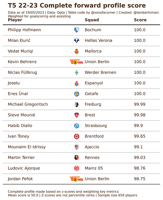
So in the image above you can see a list of 15 players who based on all the metrics selected (same as the radar percentile ranks) have the best score with z-scores calculated. None of these metrics have been weighted and if you look at this, you might not feel these are the best complete forwards around. Mind you, this data does show more intent and style rather than performance.
We set out to look at players who are good at goal contribution: goals and assists. So let’s weigh goals, expected goals, assisted and expected goals assisted at 2 and the rest at 0.5 -> to assert importance/relevance.
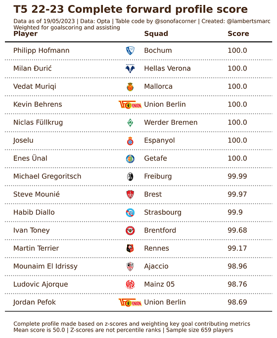
What has changed? Nothing much in terms of ranking the players’ position based on z-score. What has changed though is the z-score of the players. The mean has changed because of the weighing, therefor the score has changed too. This still gives us the most “complete” forwards but is weighted for goals and assists. Not a big difference at all.
Again, goal contribution is vital and therefore we will move from the profile: from complete forward to goal contributing forward. This means I will for the sake of this exercise value the shots on target %, non-penalty xG, goals, assists and expected goals assisted.
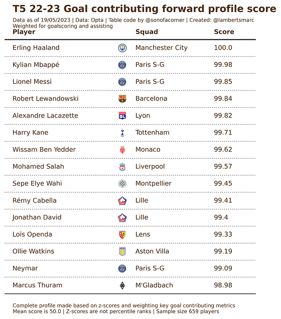
If we only look at goal contribution and leave the other metrics out of it to see which players contribute to goals and do it well, we get a very different list. Now we see a few players that have done exceedingly well in their respective leagues for goals and assists.
We wanted to look at goal contributions, but what if we value goals twice as much as assists? Who gets the best score out of it then?
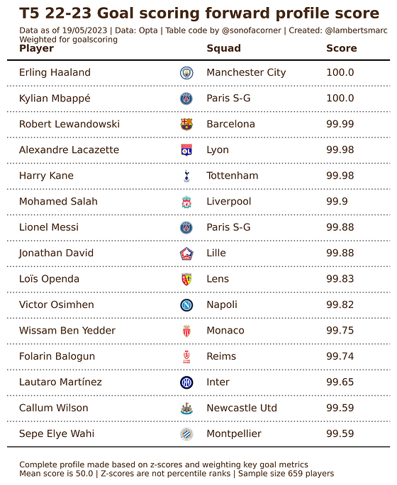
There we have it, the goal-scoring forward of the T5 leagues weighting for goal contribution with emphasis on goal scoring. This gives us an idea of which forwards are really scoring well against the mean if we are looking at goal scoring. The players listed could also be regarded as players who do well in the eye test for diverse reasons.
Again, z-scores do not equal good performances but indicate how a player scores against the mean of the data. It gives us the players most likely to fit a certain role within the arsenal of a forward.
Similarity scores
We have now looked at rankings with the percentiles, and the data deviance against the mean with z-scores, but there is another thing: similarity scores. We are not looking at who scores the best or who scores highest/lowest related to the mean — we want to find similar players. Will we find the same players as in the rankings?
Similarity doesn’t measure performance, but looks at the data and gives the players who are most similar to the data. The more data you give, the more the similarity will look at different data. We are going to do the same as above, as we want to look for goal-contributing players.
Of course, we need a player to focus on and we want to find players similar to Erling Haaland according to the data.
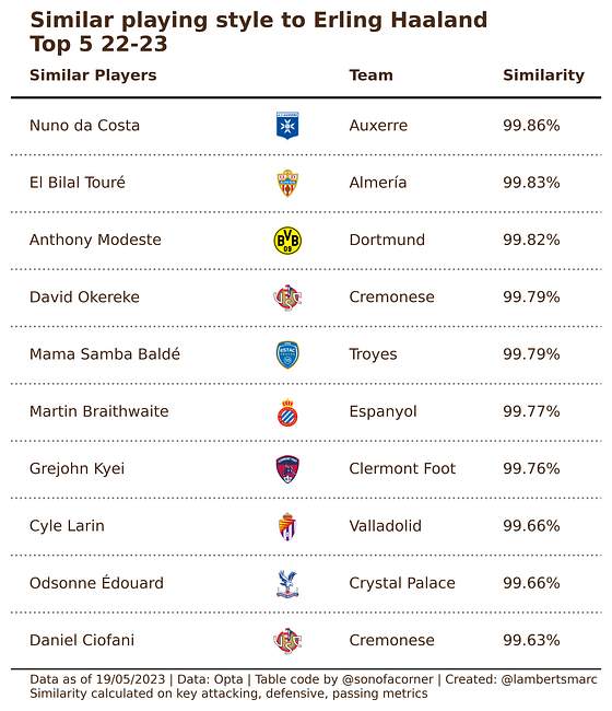
This similarity is based on all metrics that are featured in the percentile radar plot. Basically looking at key metrics in attacking, defensive and passing. Now these players are most similar to this data specific to Erling Haaland, but not necessarily have the same profile.
Therefore we can weight the metrics so that goals and assists are more important.
Now we have taken the same data set with the attacking, defensive and passing metrics, but given them a weighting. We have weighted the goals and assists metrics with 1.0 and the rest with 0.3, making the goal contribution twice as important as the rest.
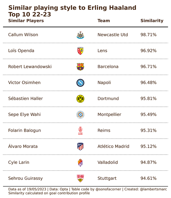
As you can see more typical goal-creating and scoring players are listed, which are more similar to Erling Haaland. Now, what happens if we only list those goal contribution metrics with an emphasis on goal scoring?
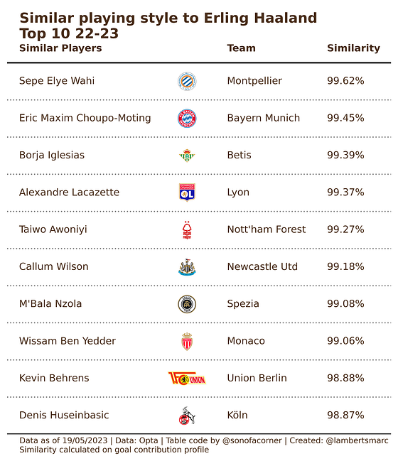
So when we have the data metrics selected that we want, we calculate the similarity and see the similar players with that specific data. These players have similar data per 90 minutes that reflect goalscoring.
Final thoughts
The aim of this article was to illustrate that how you choose to rank players or compare players, has an impact on the outcome. You have a bias and that will be reflected in your data analysis. When working with data it’s important to be aware of your context and that data often shows you intention/style over performance — that is also shown in the examples above.
They all have their merits, but I would say that generating/creating a one score data metric to judge players’ performances by, probably isn’t very wise. If you want to look at different roles of player it can definitely help, but reducing it to one score — can be counter-productive in my opinion.