Recently I got access to tracking data of the Premier League 2022–2023 season, and I was playing around with it. The initial idea was to combine it with event data to see what I could build with it in terms of pitch control. But accidentally I found that the goalkeeper data in event data is so small; it’s actually not well suited for data analysis.
When we look at the average in this season, there are 5400 seconds in a game (90 minutes). The on-ball actions of a goalkeeper correspond to 36 actions per 90 minutes, across 7 categories:
- Passes
- Goal kicks
- Free kicks
- Aerial claims
- Saves
- Clearances/interceptions
- Loose-ball recoveries.
Those 36 actions have durations ranging from 0.65 seconds to 5.79 seconds. And, yes, you must already feel it; that’s very little. In fact, it makes 108.5 seconds of the total of 5400 seconds in a 90-minute game. This means that we capture roughly 2% of the game for goalkeepers, and I think that’s unacceptable. To really capture what goalkeepers add and do to the game, we have to look at the other 98%, and we can only do that with tracking data.
We could even take it a step beyond. We only have 2% of the game on the record for goalkeepers. Yet we still see that Save %, Goals conceded, and Clean Sheets dominate how we talk about goalkeepers from a data perspective. They do give information, but they are heavily influenced by their context. Even if we look at the most advanced statistic we use: Post-Shot xG (PsxG), it’s such a small part of the game. If we look at saves, they account for 3,8 second of 5400 seconds. This means that we train our most advanced shot-stopping model on roughly 0.07% of the game. This isn’t criticism of the model itself, but a realisation of how little of each game they are trained on.
I’ve created a new goalkeeper model that incorporates tracking data alongside the event data. With it, I’ve been able to create goalkeeper profiles, as well as really building a recruitment model for goalkeepers, specifically. The event data isn’t wrong by any means in their data, but it’s just 2% and shows what happens on the ball. But what if we expand that and look at where everything happened for goalkee[ers?
Contents
- Data source
- What’s tracking data?
- Literature review
- Data representation
- Casestudy I: Sweeper depth & box occupancy
- Casestudy II: Aerial exposure via ball height
- Casestudy III: Ball-side tracking correlation
- Casestudy IV: Set piece movement detail
- Casestudy V: David Raya (fused profile)
- Combining tracking data with event data
- Final thoughts
- Sources
Data source
For this research, I have two different sources. First of all, there is the tracking data. This comes from Skillcorner, who have tracking data, but also running data. I’m focusing here on the tracking data, and it’s a full season of the Premier League 2022–2023. These files are quite large, and I have saved them on my computer as “jsonl.gz” so they will be around 10MB per file. Otherwise, they would be “jsonl” and around 8 times as big.
For the event data, which I’m using later on in this article. I’m using IMPECT event data. This is the same season as the tracking data to make it more aligned and show what can be done in combination. The Premier League 2022–2023 files are saved as “json” files on my computer.
Metrics are being created with these two providers, but when the metrics are created, they are marked as provider Walzting Analytics, which is the name of my company.
What’s tracking data?
Tracking data doesn’t tag anything. It just records where things were, continuously, whether or not anything meaningful was happening.
For this project, I’m using SkillCorner’s broadcast tracking of the Premier League 2022/23 season: 380 matches, 10 times a second, for every player visible on screen plus the ball. That’s the “10Hz” you’ll see referenced throughout: ten frames per second, or roughly 57,000 frames across a 95-minute match. It’s worth being precise about what kind of tracking this is, because not all tracking data is equal. This isn’t optical, in-stadium tracking captured by fixed cameras around the pitch — it’s broadcast tracking, extracted from the same TV feed you’d watch the match on, using computer vision to detect and follow players frame by frame. SkillCorner’s version of this has actually been FIFA-certified at the “Basic” tier of the EPTS quality programme (SkillCorner, n.d.-b) — a meaningful stamp of legitimacy, but also a signal that broadcast tracking sits a rung below the gold-standard optical systems clubs install in their own stadiums. That distinction matters more than it sounds like it should, and I’ll come back to exactly why in a moment.
Here’s what a single frame of this data actually looks like, stripped down to the essentials:
{
  frame, period,
  ball_data: {x, y, z, is_detected},
  possession: {group},
  player_data: [{x, y, player_id, is_detected}, ...]
}
No pass. No shot. No save. Just an x and a y for every player the camera can see, an x, y, and z for the ball, its height, a dimension almost nobody actually uses, and one I’ll spend a whole section on later, and a flag telling you which team currently has the ball. Repeat that ten times a second for ninety minutes, for 380 matches, and you get a genuinely enormous, genuinely unlabeled dataset: millions of frames that know exactly where everyone stood and never once tell you why.
That absence of labels is the entire point of this piece. Event data can only describe the instant something happens. Tracking data can describe everything in between, which, as I found out, turns out to be nearly all of it.
Literature review
Goalkeeper analytics has come a long way over the last decade, but almost all of that progress rests on event data. Marcolongo and Myers (2026) built Total Goalkeeper Performance, a composite metric covering shot-stopping, cross-collection, sweeping, and distribution, and found it explains a real chunk of the variance in team success. That’s a genuine step past save percentage. Yam (2026), presenting at the MIT Sloan Sports Analytics Conference, proposed something similar: a probabilistic framework spanning the same four domains. Fatayri, Serykh, and Gumin (2022) pushed further still, trying to model the decision behind a goalkeeper’s action rather than just its outcome.
All of this is real progress. It’s also, by construction, limited to whatever an event provider decided to tag: passes, catches, saves, sweeps. None of it can see what a keeper does in the much larger stretch of time between those tagged moments.
That gap isn’t an oversight; it’s baked into how these models work. Bajons and Kook (2025) say it plainly: post-shot expected goals models leave out goalkeeper positioning by design, since the model only conditions on shot characteristics. Whatever a keeper does off the ball- the sweeping, the shape, the anticipation- sits completely outside what these frameworks can ever measure.
Tracking data is the obvious answer, and its value for off-ball analysis is already well proven elsewhere in the sport. Spearman’s pitch control work (Training Ground Guru, n.d.; Higgins et al., 2023) showed that continuous positional data could quantify spatial value in a way event data simply can’t. What hasn’t really been done is pointing that same logic at goalkeepers specifically, and doing it honestly: broadcast tracking has real, documented quality problems (Penn et al., 2023; Choi, 2026) that any serious use of it has to confront head-on rather than quietly ignore. That’s what this piece tries to do: take the pitch control era’s core insight and finally apply it to goalkeepers, treating data quality as part of the argument instead of a footnote to it.
Data representation
We have seen where the data comes from, but now we must work with the tracking data to create metrics that we wouldn’t be able to. The first thing that’s very important is that you check the coordinates of X, Y and Z, because they are aligned with the stadium and not a pitch. So we need to normalise the coordinates so it fits well to our Skillcorner pitch, which we use with MPLsoccer.
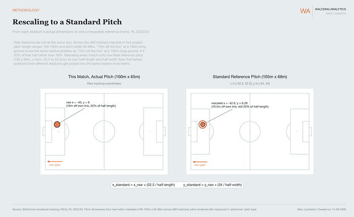
Like you can see here above, I’m rescaling to a FIFA pitch of 105 x 68 and making sure the pitch is normalised to a Skillcorner coordinates pitch. This makes the data better and all in one standard, which allows to go forward by creating metrics from this data.
Now, for every frame that we have, we can follow each player in possession and without possession. We can monitor the behaviours of the goalkeeper when they are on the ball themselves, when they don’t have the ball but their team has or when the opposition has the ball. This gives us many more data points to look at, and more importantly, we can look at positioning. This wouldn’t be possible with event data alone.
This is a continuous state where 100% of movements are tracked and not only the 2% on the ball. This can give us so much information about what a player does off the ball, how they position and how they contribute to tactics. The issue with event data is that it will only measure what is tagged. But the off-ball behaviour isn’t tagged to begin with, and therefore we would never see it in the light of day.
So how do we go from standardised, normalised data to metrics? Let’s have a look.
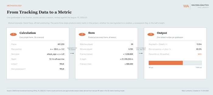
Every metric in this project comes out of the same three steps. A single frame gets normalised, that calculation repeats across roughly 1.6 million frames over a season, and the sum gets ranked against every other qualified goalkeeper. David Raya averages 13.9 metres off his own line across the season, which lands him in the 64th percentile among the 28 keepers who played enough minutes to qualify.
Casestudy I: Sweeper depth and box occupancy
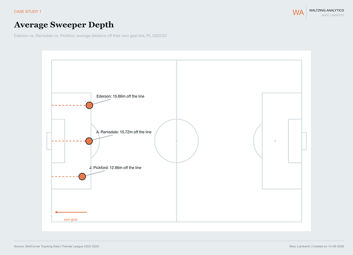
In the image above, you see a pitch featuring three different goalkeepers. These goalkeepers are measured in their average distance off their own goal line, which translates to off-ball average sweeper depth.
Ederson is on average 15.86m off his line, followed by Ramsdale with 15.72 and Pickford with 12.86m off the line. That higher or lower line also translates into box occupancy:
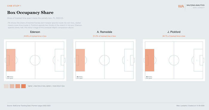
In the image above, you can see the box occupancy. This shows how much of the tracked time is in the box. The opacity of the box shows the low/high number in the box.
For Ederson, we can see that he is in the lightest category of the three, as he has 48.6% of the time in the box. Meaning that he spends most of the time outside the box. Ramsdalse spends 51.2% of the time in the box and spends less than half of the time outside it. Pickford has a different opacity altogether, which is also attributed to two-thirds of his time being spent inside the box.
Casestudy II: Aerial exposure via ball height
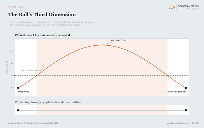
In the image above, we see an example of a high pass. With event data, we would only see a straight line, such as shown on the bottom. But with tracking data, we can track the flight of the ball and see how high the ball went.
Now, if we want to see the high balls and combine it with how often the goalkeeper leaves his line, we can measure that too:
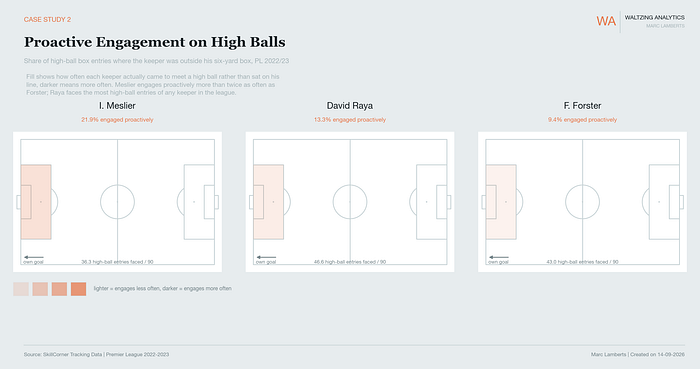
In the image above, we can see how proactive goalkeepers engage in engaging with high balls. It shows us what the share is of high ball entries into the box where the goalkeeper meets the ball compared to where they stay on the line. The darker the box, the more engagements the goalkeeper had.
You can see that Meslier had the fewest high balls of the three on average per 90 minutes, but had the highest engagement proactively with 21.9%. Raya had the most high balls faced, with an engagement percentage of 13.3% proactively. Forster had relatively many balls to face, but had a low engagement with 9.4%.
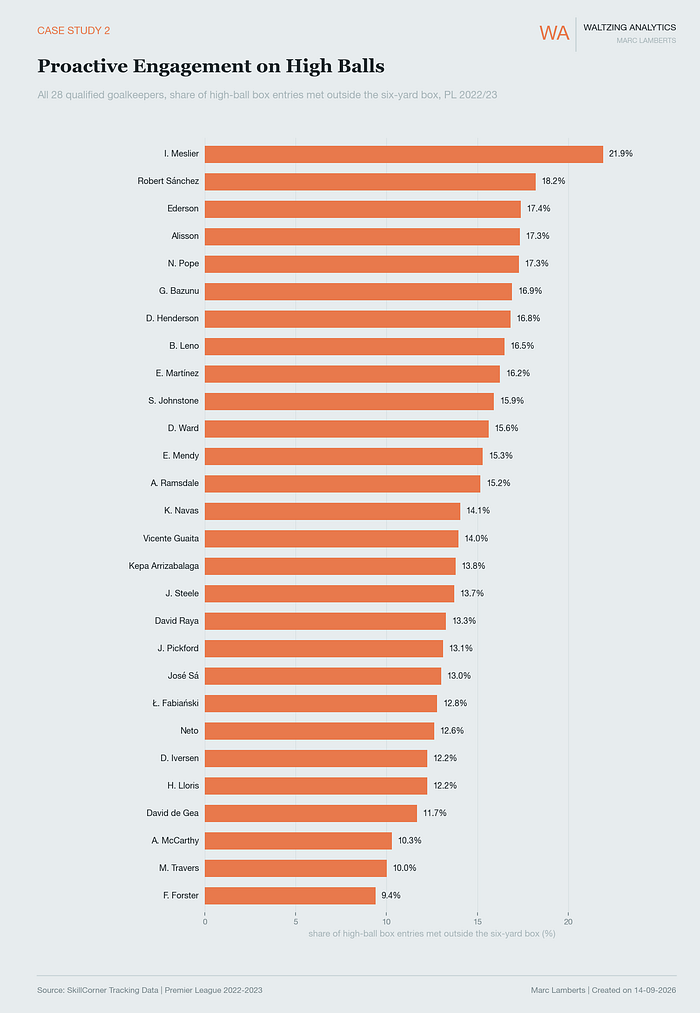
As you can see in the full ranking, Meslier, Robert Sanchez, and Ederson score the highest. McCarthy, Travers and Forster score the lowest.
Casestudy III: Ball-side tracking correlation
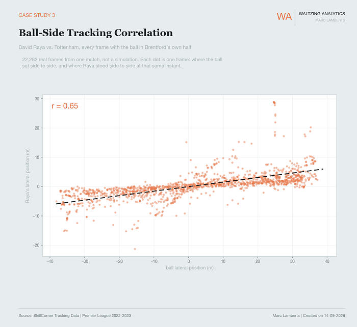
Every dot is one real frame from one real match (Raya vs. Tottenham, 22,282 of them, sampled down to 1,400 for readability). The x-position of a dot is where the ball sat left-to-right at that instant; the y-position is where Raya stood left-to-right at that same instant. If Raya’s positioning had nothing to do with the ball’s side, this would be a random cloud with no shape. Instead, it’s a clear rising band, left to right, bottom to left, matching the ball moving right; Raya’s position moves right too.
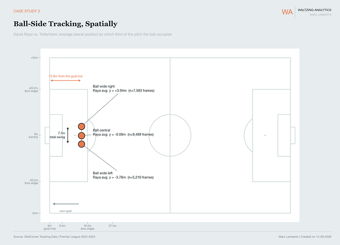
We can see this on this pitch map even better. If the ball goes wide left from an attacking perspective, Raya moves 3.78m from the centre. If it’s central, Raya moves 0.08m from the centre. And if it’s right, Raya moves 3.94 from the centre. He has a total swing from left to right of 7.7m and, on average, is 13.9m from the goal line.
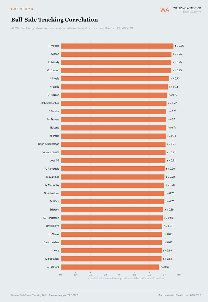
Correlation runs from -1 (perfectly opposite) to +1 (perfectly matched). It tells us how close to perfect a goalkeeper mirrors the ball’s movement.
The goalkeepers who score highest are Meslier, Alisson and Mendy. The goalkeepers who score lowest are Neto, Fabianski and Pickford. We can measure this with the correlation.
Casestudy IV: Set piece movement detail
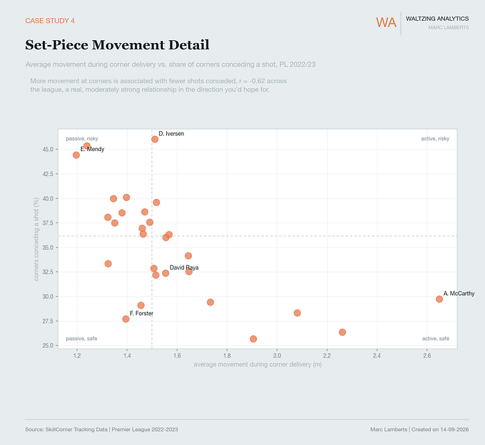
In the scatterplot above, you can see the average moment during corners of goalkeepers compared to the corners conceding a shot in %.
What’s interesting is that Iversen moves little and concedes the most, while McCarthy moves the most and concedes the fewest. The correlation is also r=0.62, which is a relatively good correlation.
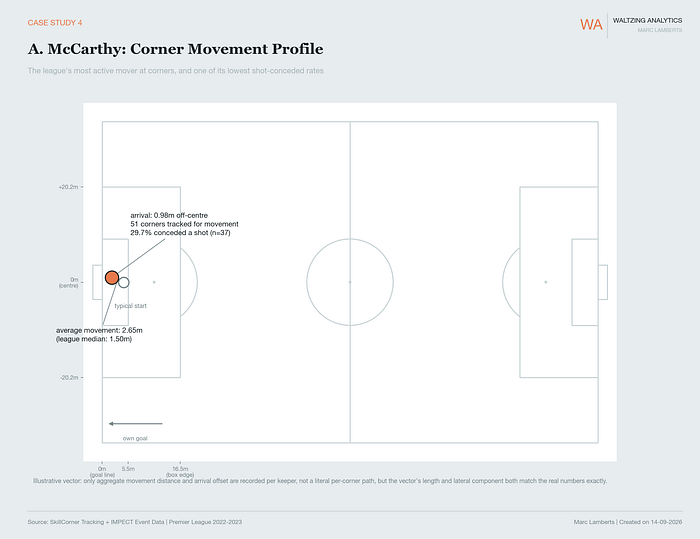
In the pitch map above, we see the movements of McCarthy during this Premier League 2022–2023 season.
His average movement from his starting point to where the ball arrives is 2.65m. This is the most active mover in the Premier League 2022–2023. The league median is 1.50m.
In terms of where he arrives, he is 0.98m off centre. That means that his 2.65m movement leads him, on average, 0.98 m off centre. This doesn’t lead directly to 29.7% conceding shots from corners, but it’s something we can only look at from tracking data.
Casestudy V: David Raya (Profile)
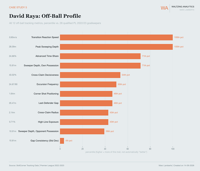
In the image above, you can see 12 distinct off-ball metrics. These have been created with the tracking data.
- Sweeper Depth, Own Possession: average distance (metres) off his own goal line while his team has the ball. Higher means he plays further up to support build-up.
- Sweeper Depth, Opponent Possession: the same measurement, but for when the opponent has the ball. Usually lower than the own-possession figure, since most keepers sit deeper when not in control of play.
- Peak Sweeping Depth: the single furthest distance off the line recorded all season, a one-off excursion rather than an average. Shows how far he’s capable of going when the moment calls for it.
- Last-Defender Gap: average distance between the keeper and his own deepest outfield defender. A smaller gap means the keeper plays closer to his back line, tighter to the defensive shape.
- Gap Consistency (Std Dev): how much that last-defender gap varies match to match and moment to moment. Lower means steadier, more predictable positioning relative to the defence; higher means the gap swings around a lot.
- High-Line Exposure: share of time spent positioned in a way that leaves him vulnerable if the ball gets played in behind, i.e., too far from goal relative to where his defence is holding the line.
- Excursion Frequency: how often per 90 minutes he makes a clear sweeping run out of his box to intercept or clear a ball before an attacker reaches it.
- Advanced Time-Share: percentage of his total minutes spent in an advanced position (well off his line), rather than sitting close to goal.
- Transition Reaction Speed: how fast he moves, on average, in the first second after his team loses or wins the ball. A proxy for how quickly he reacts to a sudden change in the game state.
- Cross-Claiming Radius: the average distance from goal at which he actually claims a cross, rather than staying rooted to his line.
- Cross-Claim Decisiveness: of the crosses that come into his box, the share he actually comes to claim rather than leaving for a defender or letting go past.
- Corner Shot Positioning Bias: at the moment a shot is taken from a corner situation, how far off-centre (metres) he’s positioned relative to where the shot is coming from, capturing a subtle positioning tendency rather than a save outcome.
Combining tracking data with event data
We have spoken about tracking data until now, and yes, it’s true that tracking data is very important. However, it’s even stronger in combination with event data. Using them both to create aggregated data makes it even stronger for scouting and analysis.
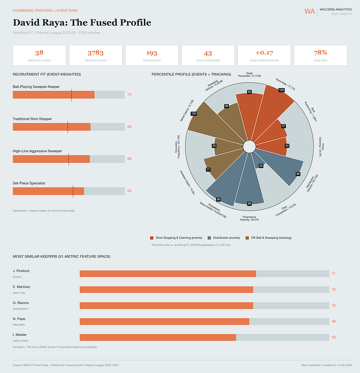
In the dashboard above, you can see the fused profile of David Raya, then of Brentford. You can see some basic information about his season at the top. On the left, you can see some role fits for a goalkeeper, and he scores highest for a ball-playing sweeper keeper.
On the right, you can see a combined pizza plot of on-ball and off-ball metrics, where we see data from Skillcorner and IMPECT combined. On the bottom, we see a similarity ranking on the metrics.
What I like to zoom into is the fit score and how it’s being built. You can see the ball-playing sweeper-keeper as an example:
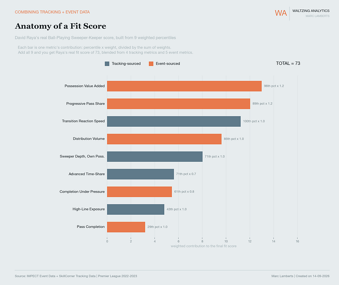
As you can see, David Raya has a profile score of 73. This consists of 4 metrics coming from tracking data and 5 metrics coming from event data. They all have their own specific weights, which appear next to the bar. So, you can see which metrics are most important, and from which type of data source they come.
Final thoughts
This project has been about completeness. Event data measures saves, passes, catches, real things, but a sliver of a goalkeeper’s game. Tracking data fills in the other 98%: positioning, movement, tendencies that never get tagged because nothing “happens” for an event feed to record. A club scouting on save percentage and clean sheets alone is working with one eye closed.
That doesn’t come free. Broadcast tracking isn’t optical-grade; a real share of every frame is interpolated, and metrics built on instantaneous speed, like transition reaction speed, likely understate the true number. Detecting things like corners from raw positions is inference, not certainty, and some real moments get missed. The percentiles here are only meaningful against this one pool, 28 qualified Premier League keepers, one season, and a few set-piece numbers rest on small samples that deserve caution, not a confident headline.
None of that undoes the point. It just means tracking data needs the same scrutiny event data always should have gotten. Handled carefully, it’s the only way to see the 98% of a goalkeeper’s game nobody’s been measuring.
Sources
Bajons, R., & Kook, L. (2025). Rethinking player evaluation in sports: Goals above expectation and beyond. arXiv. https://arxiv.org/abs/2509.20083
Choi, S. (2026). Training-free off-screen player imputation for broadcast-based spatial football analytics. arXiv. https://arxiv.org/abs/2607.11548
Coaches’ Voice. (n.d.). The modern goalkeeper: Football tactics explained. https://learning.coachesvoice.com/cv/modern-goalkeeper-football-tactics-explained-alisson-ederson-ter-stegen/
Fatayri, S., Serykh, K., & Gumin, E. (2022). What drives a goalkeepers’ decisions? arXiv. https://arxiv.org/abs/2211.00374
Higgins, L., Galla, T., Prestidge, B., & Wyatt, T. (2023). Measuring the pitch control of professional football players using spatiotemporal tracking data. Journal of Physics: Complexity, 4(2), Article 025008. https://doi.org/10.1088/2632-072X/acb67d
Lamberts, M. (n.d.-a). The challenges of data-driven goalkeeper analysis in football. Medium. https://marclamberts.medium.com/the-challenges-of-data-driven-goalkeeper-analysis-in-football-4dc6147a2af
Lamberts, M. (n.d.-b). Goalkeeper data analysis: WSL 22/23. Medium. https://marclamberts.medium.com/goalkeeper-data-analysis-wsl-22-23-5871c6d4b8cb
Marcolongo, D. J., & Myers, B. R. (2026). Total Goalkeeper Performance (TGP): A comprehensive metric for evaluating modern soccer goalkeepers. The Sport Journal. https://thesportjournal.org/article/total-goalkeeper-performance-tgp-a-comprehensive-metric-for-evaluating-modern-soccer-goalkeepers/
Penn, M. J., Donnelly, C. A., & Bhatt, S. (2023). Continuous football player tracking from discrete broadcast data. arXiv. https://arxiv.org/abs/2311.14642
SkillCorner. (n.d.-a). Does camera position and capture style affect tracking quality? https://landing.skillcorner.com/articles/does-camera-position-and-capture-style-affect-tracking-quality
SkillCorner. (n.d.-b). SkillCorner achieves FIFA Quality Programme certification for Electronic Performance and Tracking Systems. https://landing.skillcorner.com/articles/fifa-epts
Training Ground Guru. (n.d.). William Spearman: How Liverpool create pitch control models. https://archive.trainingground.guru/articles/william-spearman-how-liverpool-create-pitch-control
Yam, D. (2026). A data driven goalkeeper evaluation framework [Conference paper]. MIT Sloan Sports Analytics Conference. https://www.sloansportsconference.com/research-papers/a-data-driven-goalkeeper-evaluation-framework
Groom, S., Groom, M., Belo, F., Rice, A., Anderson, L., Darvariu, V.-A., & Wang, S. (2026). Maximising the set-piece return: Optimising football corner tactics with graph reinforcement learning. arXiv. https://arxiv.org/abs/2606.06353
Hudl StatsBomb. (2024, July 3). Finding similar players. https://blogarchive.statsbomb.com/articles/soccer/finding-similar-players/
Wei, X., Tang, C., Chmura, P., Krustrup, P., & Bjørknæs, L. (2025). Understanding the variability and determinants of corner kick effectiveness in professional football: A comparative and predictive analysis. Intelligent Sports and Health, 1(3), 179–185. https://doi.org/10.1016/j.ish.2025.06.004