Data Solutions: Does the Chart Match the Data?
A worked example of the Data Solutions tile — not a model or a pipeline, but a piece of custom analytical thinking applied to two design questions that sit upstream of any dashboard. First: when a radar chart makes two players look clearly different, is that difference actually in the data, or is it an artefact of the chart (written up in this article)? Second: when two providers both report "progressive passes" for the same match, why are the numbers nowhere close (written up in this article)? Both are about the same underlying discipline — checking whether a number or a chart is actually saying what it looks like it's saying, before it goes in front of a decision-maker.
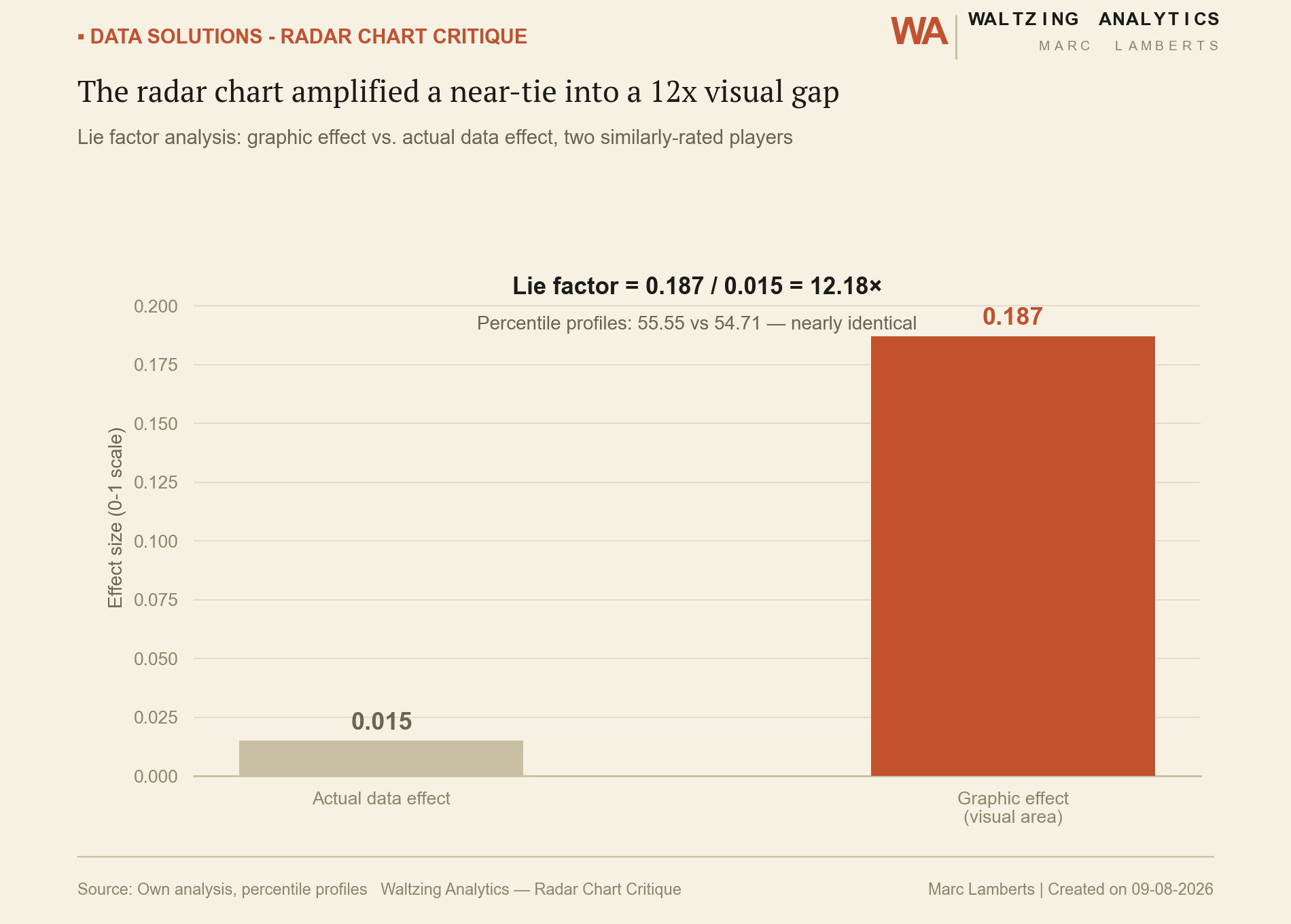
Lie Factor: does the visual area match the real gap?
Lie Factor compares how much a chart's visual effect changes against how much the underlying data actually changes. A factor of 1.0 means the chart is honest; anything higher means it's exaggerating.
Is the gap even real?
A permutation test answers a different question: even taking the chart at face value, is a difference this size unusual — or is it the kind of gap you'd see between two randomly chosen players anyway?
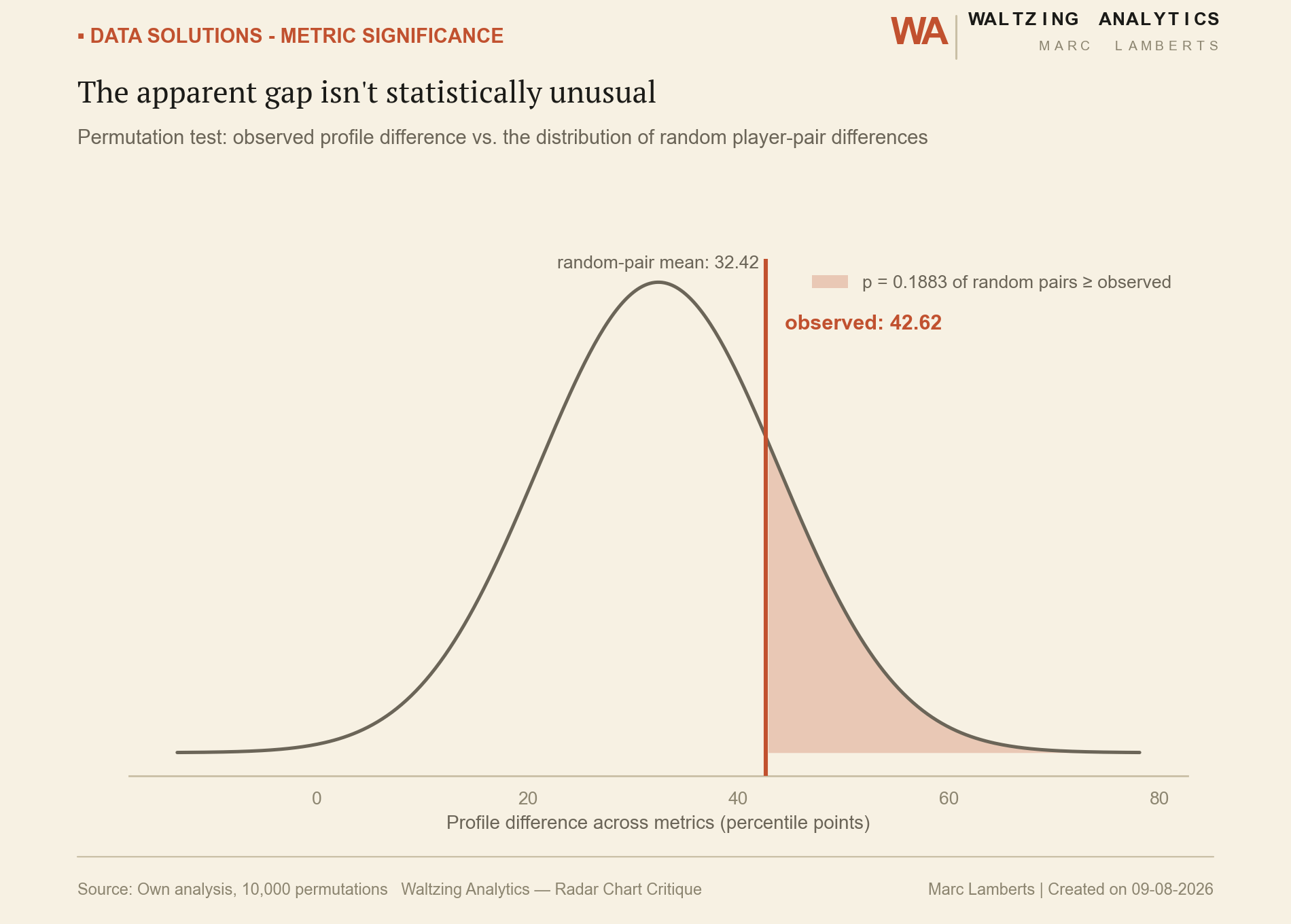
Together, these say the same thing two different ways: the radar chart was telling a more dramatic story than either the raw data or the statistics support. That's the kind of question a custom Data Solutions engagement is built to ask before a chart goes in front of a recruitment meeting — not just build the visualization, but check whether it's honest.
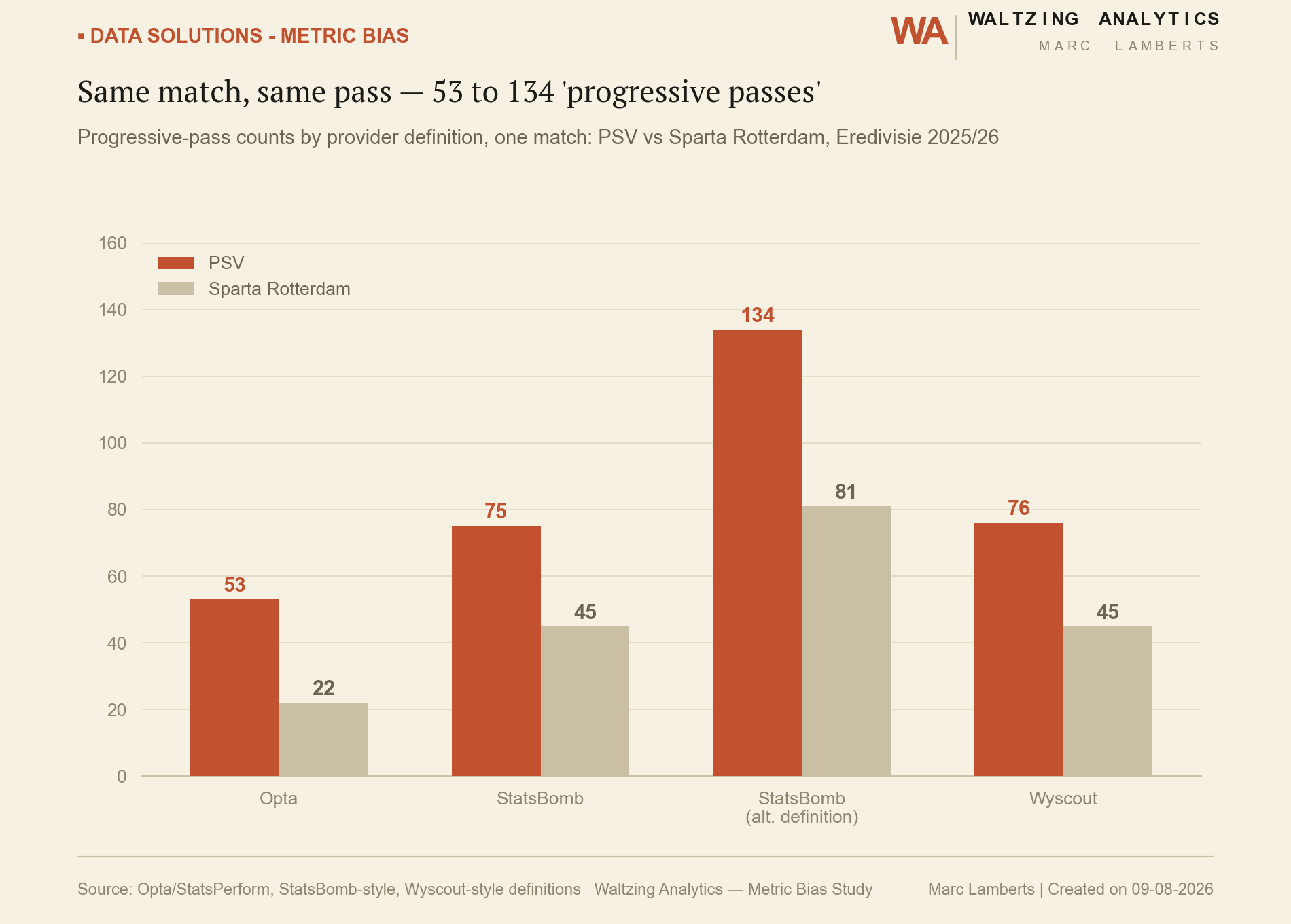
Same match, same pass — 53 to 134 "progressive passes"
The second question isn't about the chart at all — it's about the metric underneath it. "Progressive passes" sounds like a single, well-defined stat. It isn't. Four different provider definitions applied to the same match — PSV vs Sparta Rotterdam, Eredivisie 2025/26 — produce four different counts for the same team.
Even "the same thing" isn't the same thing
Ball-carrying shows the same pattern from a different angle: three definitions that all claim to measure "moving the ball forward with your feet" disagree by an order of magnitude, not a rounding error.
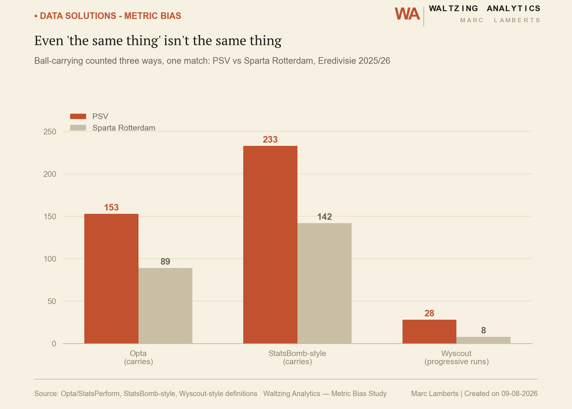
Neither provider is "wrong" — each definition is internally consistent, just not the same definition. The risk isn't using any one of them; it's comparing a number from one source to a number from another without checking that they mean the same thing. That check — before a metric gets built into a report, a scouting model, or a recruitment shortlist — is the other half of what a Data Solutions engagement does.
As a service
Commissioned, this is the option when the ask doesn't fit a template: a metric audit before you commit to a data provider, a one-off model built around a specific question, a report format designed from scratch for how your staff actually work. Scoped and delivered end to end, starting from a conversation about the real question you're trying to answer, not a menu of pre-built options. Get in touch to talk through what you need.