
As I’m a product of the online data analysis sphere on Twitter (I refuse to call it X), I’m very well familiar with radar charts and pizza plots. In fact, I have been using them on social media, written articles and in club work as well. But recently, I’ve been very hesitant to use them because I genuinely don’t know whether they are good or bad. So that’s why I took the time to research their purpose and validity in football scouting.
I’m fairly confident that when I start writing about these, people from the established data providers will come for me, but I don’t actually care. One of the biggest threats to the data departments across football clubs, is the height of data illiteracy. That’s why understand radar charts are so important.
In this article, I will take a closer look at what radar charts are, which versions are typically used, and what the strengths and pitfalls are.
- Radar charts
- Different types of radar charts
- Strengths
- Lie Factor
- Permutations Test
- JND Testing
- ANOVA
- Final thoughts
Radar charts
A radar chart is a way of visualising multivariate data by arranging variables around a circle rather than along straight axes, like we do with bar charts. With multivariate data, we mean that we observe different types/categories of data at the same time. Each variable is given its own axis, radiating outward from a central point, and all axes are spaced evenly in angle. Values are plotted along these axes and then connected, producing a closed, often irregular polygon that represents a single observation.
What distinguishes the radar chart is not just its circular layout, but the way it translates a list of values into a shape. Each value extends outward and forms a geometric figure whose contours reflect the balance, imbalance, or distribution across dimensions.
In theoretical terms, the chart can be understood as mapping an n-dimensional vector onto a radial coordinate system: the identity of each variable is encoded by angle, while its magnitude is encoded by distance from the centre. The resulting polygon is therefore not just a collection of points, but a spatial expression of relationships within the data, where the overall form becomes a visual shorthand for comparison and pattern recognition.
Rather than reading values sequentially, as one might in a table or along linear axes, the viewer encounters the data as a configuration, a shape that can be scanned, compared, and interpreted at a glance.
Different types of radars
There are of course, different types of radars:
- Profile radar
- Comparitive Radar
- Normalised/percentile radar
- Stacked or layered radar
- Radial heatmap radar
- Bar-based radar
Let’s start with the profile radar. The profile radar shows a variety of metrics within the visualisation that form the profile of a specific player.
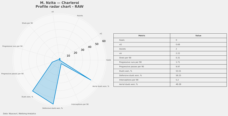
In this visualisation we can see M. Nzita from Charleroi in his profile radar. On the right we see the actual values per metric, but we have one standardised radar. This means that the values are all hold against a single value base. So in this sense, it looks like the player is really good in duels won % and bad at xA, but that isn’t necessarily true.
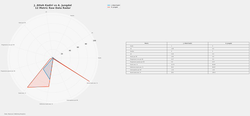
In the image above, you see a raw comparison chart. This shows the raw values for our chosen metrics in the same scale as the profile radar. It compares two specific players and gives the illustion that overal player A. Jungdal is better, but we cannot state since, we are comparing raw numbers on the same scale.
In the next step we want to level the data, so it’s more representative of our own database, because we want to see how our player compares to the whole. First we look at min-max radar charts:
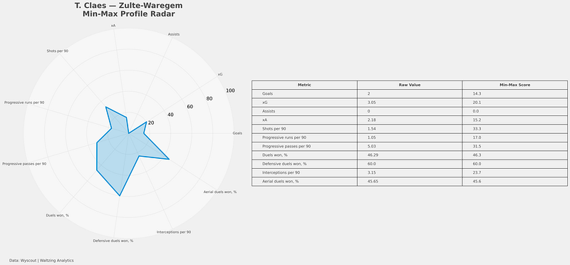
In the min-max profile radar, we see a very different figure. We see that every metric has a new value, the min-max score. This normalises the values, so it’s easier to compare them in one specific data visualisation.
The min-max radar rescales each metric between the lowest and highest value in the dataset, converting everything to a 0–100 scale. A score of 0 means the player has the lowest value in the league for that metric, while 100 means they have the highest. Every other player is positioned proportionally between those two extremes. Unlike percentile radars, which show how many players a player outperforms, min-max radars show how close a player is to the absolute best and worst values in the dataset, which makes them more sensitive to extreme outliers.
Talking about percentile radars, those are the next ones:
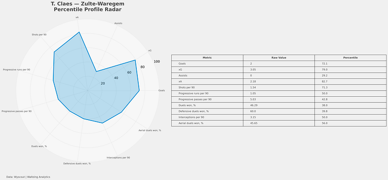
Percentile radars rank a player relative to all other players in the dataset for each metric, converting performance into a 0–100 scale based on distribution rather than raw distance. A percentile score of 90 means the player performs better than 90% of players in that metric, while 50 represents league-average standing. Unlike min-max scaling, percentile radars are less affected by extreme outliers and provide a more stable view of how dominant or average a player is compared to the rest of the population, which is why they are commonly used in football analytics and scouting profiles.
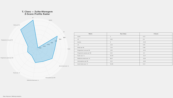
The z-score radar standardizes each metric by measuring how far a player’s performance is from the dataset average in terms of standard deviations. A z-score of 0 represents league-average performance, positive values indicate above-average performance, and negative values indicate below-average performance. For example, a z-score of +2 means the player performs two standard deviations above the mean for that metric. Unlike percentile or min-max radars, z-score normalization preserves the statistical distance between players and highlights how exceptional or unusual a performance truly is relative to the overall distribution, making it especially useful for analytical comparisons across metrics with different scales.
I want to now continue with different forms of radar charts after scaling, but I will take the percentiles radar over min-max. Analytically speaking that is the better choice, since min-max are more aesthetically pleasing, but can showing a lot skewed data. For analytics and recruitment? I would take percentile or z-scores. For visual storytelling and presentations? I would go for min-max normalisations.
If we are going to split z-scores and percentiles, there are two distinct ways you can go. If you want to go for easy to ready, communicative radars, percentiles are the better choice. This is good for meetings in recruitment and analysis. However, if you want to go deeper in the pure statistical side and not only want to see how good a player is in relation to the rest, but also how much bettter than the most common value they are, z-scores are the way to go. But they are not as easy to read.
For the purpose of the rest, I will use percentile ranks as this a public post you can read and most likely is the thing we want to use in the public space.
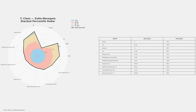
In the visualisation above, you can see a stacked percentile radar. This shows the percentiles but in another light, you can see more clearly which slices fall in which categories. This approves the readability of the charts, which percentile already scores higher on in comparison to z-scores. In this case you can see that most of the percentiles fall in the 50–75 band.
We can take it in another direction with the radial heatmap radar. I haven’t seen this a lot, but it’s an interesting one to see nonetheless.
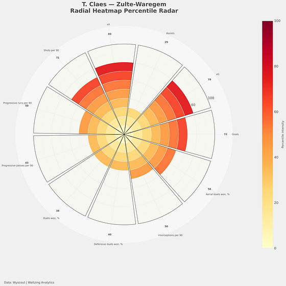
A radial heatmap radar combines the structure of a traditional radar chart with the visual intensity of a heatmap by representing each metric as a colored radial segment whose length and shading reflect the player’s percentile or normalized performance. Instead of relying solely on connected polygons, the chart emphasises magnitude through individual radial bars, making strengths and weaknesses easier to distinguish at a glance while reducing overlap and visual clutter. This approach improves readability, highlights metric-by-metric variation more clearly, and creates a modern analytical visualisation commonly used in advanced sports analytics dashboards and scouting presentations.
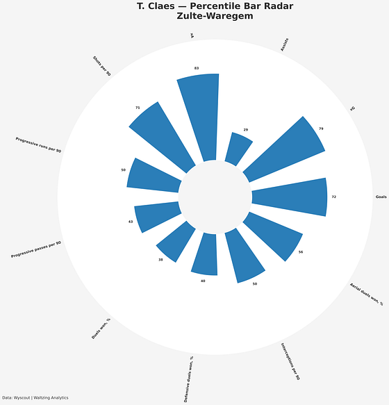
In the visual above, you can see a bar radar. For every metric there is a bar that represents a percentile value. Bar-based radar chart replaces the traditional connected polygon of a standard radar with independent radial bars extending outward from a circular center, where each bar represents the magnitude or percentile of a specific metric. Unlike classic radar charts that emphasize overall profile shape, bar radars prioritize metric separation, readability, and direct comparison by reducing overlap and visual distortion between categories.
Yes, they do look similar to pizza plots and we could say that pizza plots are a evolution from these bar based charts, but they are a distinct category. If you want to read more on those, I would suggest looking at this: https://mplsoccer.readthedocs.io/en/latest/gallery/pizza_plots/plot_pizza_basic.html
Strengths
Radar charts are effective multivariate visualisation tools because they allow multiple performance metrics to be displayed simultaneously within a single compact structure. By mapping variables onto a shared radial axis system, they provide an intuitive representation of a player’s overall statistical profile and facilitate rapid identification of relative strengths, weaknesses, and stylistic tendencies. The geometric structure of the chart makes it possible to evaluate how performance is distributed across dimensions rather than focusing on isolated variables, which is particularly valuable in football analytics where player evaluation is inherently multidimensional.
A further advantage of radar charts is their suitability for comparative analysis. Multiple player profiles can be overlaid within the same coordinate system, enabling efficient visual assessment of similarities, complementarities, and role-specific differences across a wide range of metrics. This makes radar charts especially useful in scouting, recruitment, and performance analysis contexts, where analysts seek to identify patterns, archetypes, and deviations from positional norms. In addition to their analytical utility, radar charts also provide a visually interpretable framework that supports communication of complex statistical information to both technical and non-technical audiences.
Lie Factor
Now, how can we statistically test whether the data we see, also reflects the data in our excel/csv/json files? One of these methods, is the lie factor. It shows how much cover of the area corresponds with the cover of data.
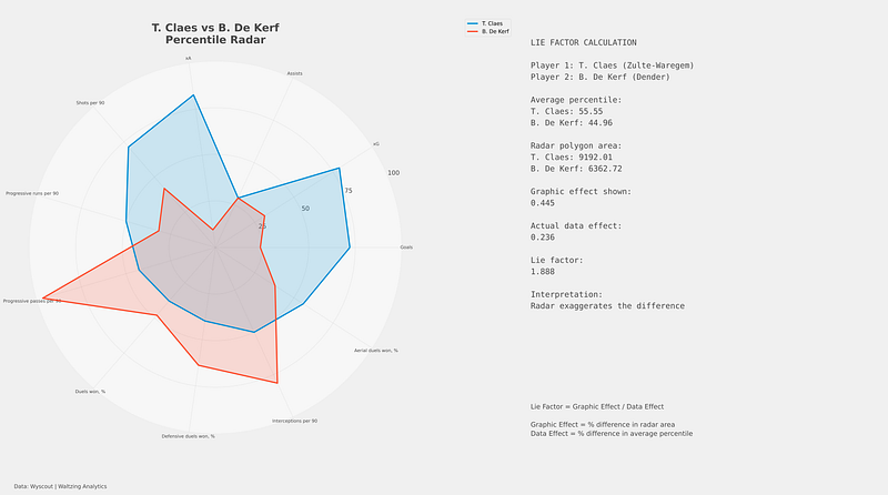
The lie factor analysis indicates that the radar chart substantially exaggerates the perceived statistical difference between T. Claes and Y. Khalifi. Although both players have very similar average percentile profiles (55.55 versus 54.71), the visual area of their radar polygons differs much more strongly, producing a graphic effect of 0.187 compared to an actual data effect of only 0.015. This results in a lie factor of 12.184, meaning the radar visualisation amplifies the underlying statistical difference by more than twelve times.
The result highlights one of the key criticisms of radar charts in statistical visualisation research: because viewers tend to perceive area rather than individual radial distances, relatively small differences across metrics can appear visually dramatic when converted into polygonal shapes.
Consequently, radar charts may be highly effective for visual storytelling and stylistic profiling, but they can also introduce substantial perceptual distortion if interpreted as precise representations of comparative performance.
Permutations Test
A permutation test is a non-parametric statistical method used to determine whether the observed difference between two players is statistically meaningful or could have occurred randomly. Instead of relying on assumptions about normal distributions, the test repeatedly shuffles the metric values between players thousands of times and recalculates the comparison statistic each iteration to build a null distribution. The observed difference is then compared against this randomized distribution to estimate a p-value, which represents the probability of obtaining a difference at least as extreme as the observed one under random chance.
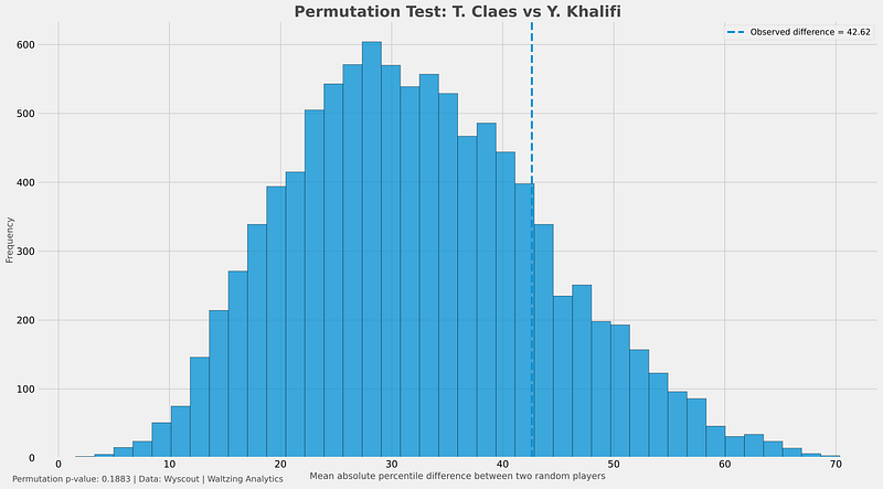
The permutation test indicates that the statistical difference between T. Claes and Y. Khalifi is not particularly unusual relative to the broader distribution of player differences within the dataset. The observed profile difference between the two players was 42.62 percentile points across the selected metrics, compared to an average random player-pair difference of 32.42 with a standard deviation of 11.42. Although the observed difference is somewhat above the dataset average, its z-position of 0.89 suggests that it remains within the normal range of variation expected between randomly selected players. This is reinforced by the permutation p-value of 0.1883, meaning that approximately 18.8% of random player comparisons produced differences at least as large as the observed one. Consequently, the analysis suggests that the apparent separation between the two radar profiles is not statistically significant and may reflect ordinary variation rather than a uniquely distinct performance profile.
JND Testing
Just Noticeable Difference (JND) testing evaluates whether the visual difference between two charts is large enough for a human observer to reliably perceive. In the context of football radar charts, JND analysis is useful because radar visualisations can sometimes exaggerate or hide differences that may not actually be perceptually distinguishable to viewers. Rather than focusing purely on statistical significance, JND testing examines perceptual significance — whether the change in shape, area, or metric magnitude exceeds the threshold at which humans can visually detect a difference. This makes it particularly relevant for evaluating the interpretability and effectiveness of radar-based visualisations in scouting and analytical communication.
For your radar comparisons, a practical JND approach is to compare the observed difference between two percentile profiles against a perceptual threshold derived from the dataset, often using Euclidean distance or mean absolute percentile difference across metrics. If the observed difference exceeds the estimated JND threshold, the profiles are likely visually distinguishable; if not, viewers may perceive them as effectively similar despite measurable statistical variation. This allows you to study not only whether players are statistically different, but also whether those differences are likely to be meaningfully perceived in the visualisation itself.
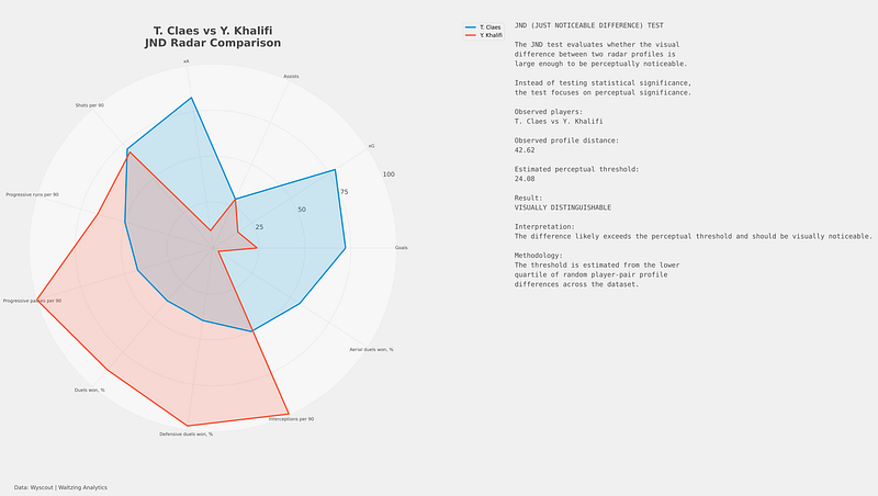
The Just Noticeable Difference (JND) analysis suggests that the radar profiles of T. Claes and Y. Khalifi are perceptually distinguishable when viewed visually. The observed profile distance between the two players was 42.62 percentile points across the selected metrics, which substantially exceeds the estimated perceptual threshold of 24.08 derived from the lower quartile of random player-pair differences within the dataset. Unlike traditional significance testing, which evaluates whether a difference is statistically unlikely under random variation, the JND framework focuses on whether the difference is large enough to be meaningfully perceived by human observers when interpreting the visualisation. In this case, the analysis indicates that the separation between the two radar profiles is not only measurable statistically, but also sufficiently large to be visually noticeable in practical analytical or scouting contexts.
ANOVA
ANOVA (Analysis of Variance) is a statistical method used to evaluate whether differences between groups or profiles are larger than would be expected from natural variability within the data. In the context of football radar analytics, ANOVA can be applied to compare player profiles across multiple metrics by examining whether the overall differences between players are statistically meaningful relative to the variation within their individual performance distributions.
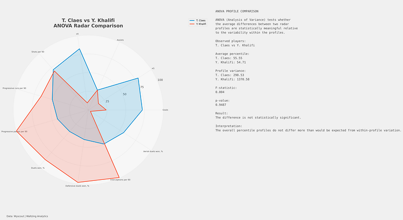
The ANOVA analysis suggests that the overall percentile radar profiles of T. Claes and Y. Khalifi are not statistically different when evaluated relative to the variability within their profiles. Although the two players exhibit slightly different average percentile values (55.55 versus 54.71), the extremely small F-statistic of 0.004 and very large p-value of 0.9487 indicate that these differences are negligible compared to the underlying variance across the selected metrics. In practical terms, the analysis suggests that the apparent visual differences between the two radar charts are not supported by strong statistical evidence and are likely consistent with ordinary variation in multidimensional player profiles rather than representing meaningfully distinct performance structures.
Final thoughts
Radar charts are neither inherently good nor inherently misleading; their value depends on how consciously they are constructed, interpreted, and contextualised. They remain powerful tools for summarising multidimensional football data into visually intuitive player profiles that support rapid comparison, stylistic identification, and communication across recruitment and analysis departments. However, as the statistical tests in this article demonstrate, the visual impact of a radar chart can diverge substantially from the underlying data structure. Differences that appear dramatic in polygonal form may not be statistically meaningful, while perceptually noticeable shapes may simply emerge from the geometry of the visualisation itself rather than from genuinely distinct player profiles. This does not make radar charts invalid, but it does require analysts to approach them critically rather than treating them as objective representations of truth.
The broader issue therefore is not the existence of radar charts, but the level of statistical literacy surrounding them. In modern football analysis, visualisations increasingly shape recruitment decisions, public narratives, and even player valuation, which makes understanding their strengths and limitations essential. Radar charts are most useful when they are treated as exploratory or communicative tools rather than definitive evaluative models. Combining them with contextual interpretation, statistical testing, and domain expertise allows them to remain highly valuable within the analytical workflow. Ultimately, the goal should not be to abandon radar charts, but to use them more responsibly, transparently, and critically in order to avoid mistaking visual impression for analytical certainty.